
App Store screenshots best practices
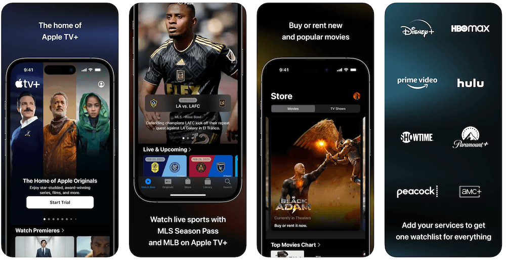
Screenshots are the part of your App Store listing that most people actually look at. Many users decide from the search results page without opening your product page, and on that page they see your icon, your name, a rating and the first few screenshots. This guide covers what to put in those images, how to keep them readable at thumbnail size, and what to check before you upload.
Design for the first three screenshots
In App Store search results, a portrait listing shows its first two or three screenshots side by side (a landscape listing shows one). If you have an app preview video, it takes the first slot. Everything after that is only seen by people who open your product page.
So treat screenshots 1 to 3 as a standalone ad. A user who never swipes further should still know what the app does, who it's for, and why it's better than the result above it. A practical split:
- Screenshot 1: the core value of the app in one line, shown on the screen where that value is most visible. Not a splash screen, not a login screen, not your logo on a gradient.
- Screenshot 2: the thing that makes you different from the competitors sitting next to you in search (the “aha” feature).
- Screenshot 3: the second most common reason people use the app, or proof that the first claim is real.
To check, search your main keyword on an iPhone and compare your listing with the competitors around it. If your first three images could belong to any app in the category, fix them first.
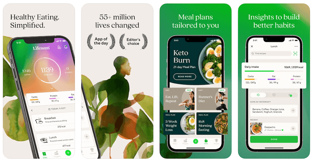
Lifesum's first three screenshots follow this pattern: the core promise over the main screen, a proof panel, then a headline feature. Each reads on its own.
One benefit per screenshot
Each screenshot should make exactly one point, and that point should be a benefit the user gets, not a feature the app has. “10 GB cloud storage” is a feature. “Never lose a photo again” is what the user gets from it. The UI underneath is the evidence that the caption is true.
| Feature caption | Benefit caption | Screen to show |
|---|---|---|
| Task timer included | Finish projects on time | A running timer on a real task |
| Automatic expense categories | See where your money goes | A monthly breakdown chart |
| Encrypted data | Your notes stay private | The lock or privacy settings screen |
| Offline maps | Navigate without signal | A map in airplane mode with a route |
Two traps. First, vague benefits: “Organize your life” fits every app in the category and says nothing. Second, screenshots that don't show the app. Apple's App Review Guideline 2.3.3 asks that screenshots show the app in use, not just title art, a login page or a splash screen. Use real UI with realistic content, not empty states.
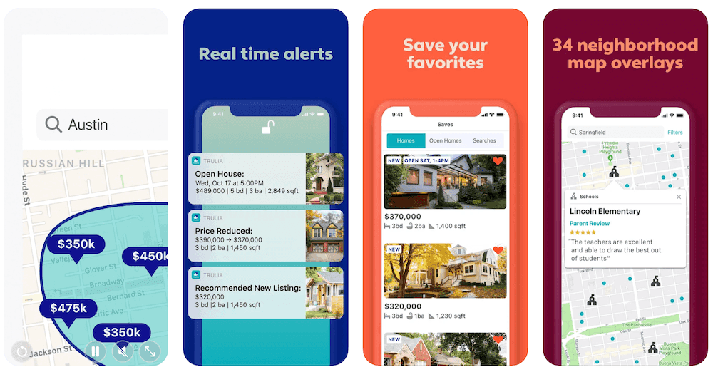
Trulia's set is a good example of specificity: “34 neighborhood map overlays” is a concrete, checkable claim, and the screen below it shows the overlay in action.
Captions and typography that read at thumbnail size
Screenshots are designed at full resolution but judged at thumbnail size. In search results each one gets a fraction of the screen width, so the caption is often the only text people read.
Caption length
Aim for one idea that fits in two short lines. If the caption needs a comma, a second sentence or the word “and”, it's probably two screenshots. Put the meaningful word first (“Budget in 2 minutes a week” rather than “The easiest way to finally take control of your budget”). Skip small subtitles under the headline: scaled down, they turn into grey noise.
Typography
- Use a heavy weight. Semibold to black sans-serif fonts survive scaling. Thin, light and script fonts don't.
- Size for the thumbnail, not the canvas. Export, then view the image at about 300 px wide on your monitor or in real search results on a phone. If you can't read the caption without zooming, it's too small.
- Keep lines short. Two to four words per line scans faster than one long line.
- Use one type system across the set: same font, same size, same position. Highlight a single word with your accent color if you want emphasis, not three.
- Use your brand font only if it stays legible. Otherwise pair your brand colors with a plain, bold sans-serif.
Visual hierarchy and contrast
Every screenshot needs one focal point. The order the eye should follow is: caption, then the key piece of UI that proves it, then everything else. Some practical ways to get there:
- Crop or zoom into the relevant part of the screen. A full screen of UI is unreadable at thumbnail size. Enlarge the one card, chart or button that matters.
- Leave empty space around the caption. Don't place text on top of busy photos or UI.
- Check text contrast. Use WCAG's contrast ratios as a floor: 4.5:1 for normal text and 3:1 for large text. White text on a pastel background usually fails.
- Check the set on light and dark backgrounds. The App Store follows the system light or dark appearance, so a white screenshot can blend into a light page and a near-black one into a dark page.
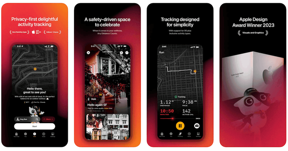
The running app above keeps contrast high with bold white captions on dark backgrounds, and one gradient ties the set together.
Device frames vs full-bleed
Both work. The trade-off:
- Device frames make it obvious what is the app and look polished, but shrink the UI and add visual weight.
- Full-bleed screenshots (UI fills the image) show the interface as large as possible. Reserve a band for the caption so it doesn't cover the UI.
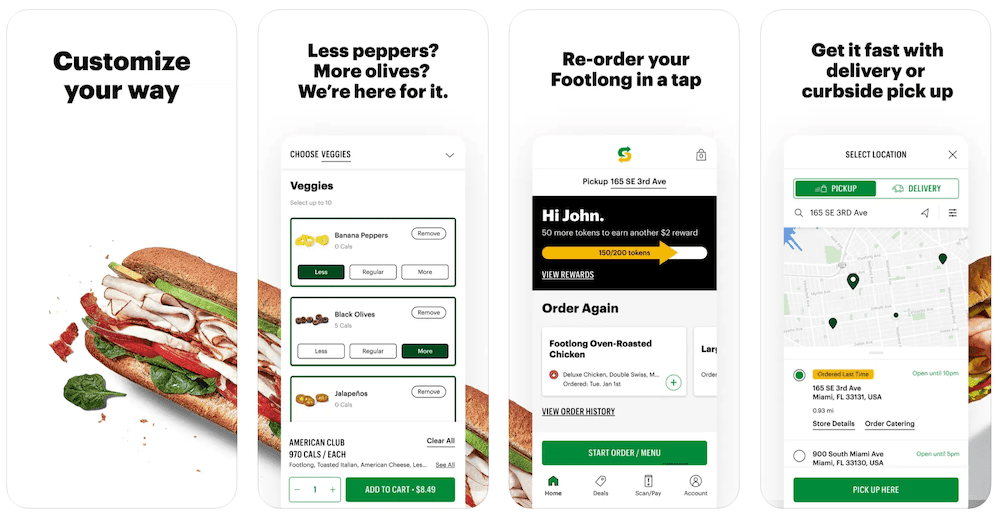
- In-between options work too: a device cropped off the edge of the canvas, a tilted device, or UI panels without a frame, as in the Subway set below.
Either way: use current Apple hardware, because an old device makes the listing look old. Use an iPad frame for iPad screenshots. Never show Android devices or other platforms in App Store screenshots (App Review Guideline 2.3.10). Clean up the status bar: the iOS convention is 9:41 with full battery and signal. In the Simulator you can set this with xcrun simctl status_bar booted override --time 9:41 --batteryState charged --batteryLevel 100 before capturing.
Keep the set consistent with your brand and your app
A set where every screenshot has a different layout, font or color looks unfinished, and users read that as a signal about the app. Use one template for all of them: one background system, one caption position, one frame style, one accent color taken from the app.
Consistency also means matching the product. If the screenshots show a redesign you haven't shipped, or a UI you've since replaced, users notice after installing. Update screenshots when the screens they show change.
Order the sequence
After the first three, order the rest by how much a new user cares, not by how proud you are of a feature:
- The most common workflows.
- Secondary features, one per screenshot, most used first.
- Trust and reach: integrations, platforms, real awards or press. Apple TV ends its set with the services it connects to; the running app ends with its Apple Design Award.
If your app solves one clear pain, a problem, solution, outcome sequence across the first three also works. Panoramic backgrounds that continue across screenshots can encourage swiping, but each image must still stand alone, since search results cut the panorama after the third frame. Only use social proof you can back up; invented testimonials do more harm than an empty slot.
Portrait vs landscape
Use portrait unless your app is used in landscape. Portrait listings show up to three screenshots per search result, landscape listings show one, so portrait gives you more surface in search. Landscape makes sense for games and apps that run sideways, where portrait would misrepresent the experience. Keep one orientation across the set.
Use the app preview video slot deliberately
You can add up to 3 app previews per localization. They autoplay without sound in search results and on the product page, and the first preview appears before your screenshots, which means it takes one of the scarce search result slots. That's only worth it if the video beats the screenshot it displaces.
- Show the core action in the first few seconds.
- Design for silent viewing: add short on-screen captions, don't rely on voiceover.
- Pick the poster frame deliberately: it's what people see when autoplay is off.
- Use footage captured from the app itself. Apple requires this; text overlays and narration are allowed on top.
If you can't make a good preview, skip it. A clear screenshot beats a slow video.
Localize captions, not just the description
App Store Connect stores screenshots per localization. A locale without its own screenshots falls back to your primary language, so a fully translated description can still sit next to English captions. For each market you care about:
- Translate the captions and have a native speaker check them.
- Leave room for longer text. German and French captions often run longer than English. Leave slack in the template so they don't shrink or wrap to three lines.
- Capture the UI in that language, with local currency, dates and content. A food delivery app showing burgers to users in Japan looks like it wasn't made for them.
- Mirror layouts for right-to-left languages such as Arabic and Hebrew, and check that fonts render correctly for Chinese, Japanese and Korean.
By hand, this multiplies the work by every locale and device size. Appure builds App Store and Google Play screenshots with device frames, translates captions into 26+ languages, and exports every required size, so the localized sets stay identical in layout to your primary one. It's free for one app.
Measure and test changes
App Store Connect reports your product page conversion rate (downloads from product page views), so you can compare before and after a change. Better, run a controlled test: Product Page Optimization lets you test up to three alternative screenshot sets against your current one, and custom product pages let you show different screenshots to traffic from different ad campaigns. On Google Play, store listing experiments do the same job.
Change one thing per test and start with the first screenshot. See how to A/B test App Store screenshots for a full testing setup.
Sizes and format
You only need to provide the 6.9-inch iPhone size (1320 × 2868 or 1290 × 2796 px) and, if your app runs on iPad, the 13-inch iPad size (2064 × 2752 or 2048 × 2732 px). App Store Connect scales them down for smaller devices. You can upload up to 10 screenshots and 3 app previews per localization, as PNG or JPEG, with no transparency. The full list of accepted dimensions per device is on our App Store and Google Play screenshot sizes page.
Google Play has different rules for dimensions, counts and the feature graphic. If you ship on both stores, read how to create Google Play screenshots before reusing your iOS set.
Pre-upload checklist
- The first three screenshots explain the app on their own.
- Each screenshot makes one point, as a benefit, backed by real UI.
- Captions are readable when the image is about 300 px wide.
- Caption text passes 4.5:1 contrast (3:1 if it's large).
- Same font, caption position and frame style across the set.
- Frames show current Apple devices; no other platforms appear.
- Status bar is clean (9:41, full battery, full signal).
- Screens match the shipping version of the app.
- Every target locale has translated captions and localized UI.
- Files are 6.9-inch iPhone (and 13-inch iPad if needed), PNG or JPEG, no transparency.
- The app preview, if any, is stronger than the screenshot it displaces.
To check dimensions and format before App Store Connect rejects a file, run your exports through the screenshot checker. To score your screenshots alongside your title and metadata, run a free ASO audit.
FAQ
How many App Store screenshots should I upload?
Up to 10 screenshots and 3 app previews per localization are allowed. Search results only show the first two or three, so put your strongest material there and use the rest for secondary features and trust signals. Stop when you run out of distinct points; padding adds nothing.
What size should App Store screenshots be?
Apple only requires the 6.9-inch iPhone size (1320 × 2868 or 1290 × 2796 px) and, for iPad apps, the 13-inch iPad size (2064 × 2752 or 2048 × 2732 px). App Store Connect scales them down for smaller devices. Files must be PNG or JPEG with no transparency.
How long should a screenshot caption be?
One idea in two short lines, readable in one glance at thumbnail size. If it needs a second sentence, split it into two screenshots.
Should App Store screenshots use device frames?
Either works. Frames add context but shrink the UI; full-bleed shows the UI larger but needs a clear caption band. Use current Apple hardware, keep one style across the set, and never show non-Apple devices.
Do I need to localize my screenshots?
If you localize your listing, yes. Screenshots are stored per localization and fall back to your primary language when a locale has none, so translated text can end up next to English captions. Translate the captions and capture the UI in that language.